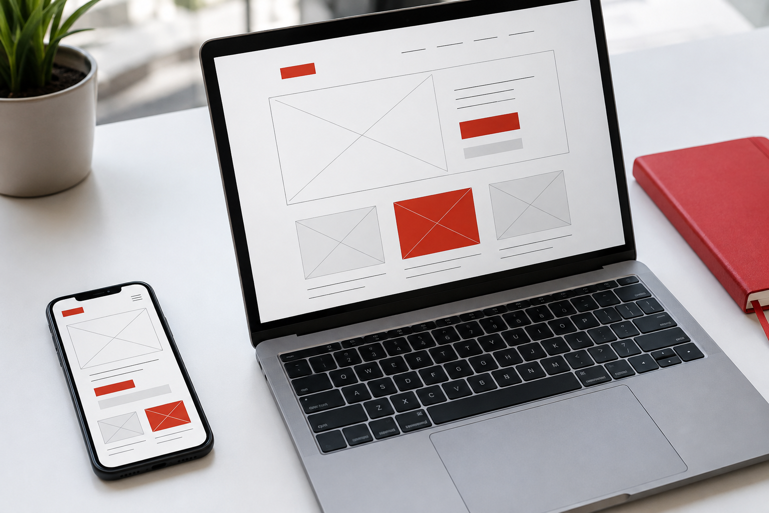
Map the user journey
Write down the steps from opening the app to completing its main task. Booking a service might involve choosing a service, selecting a time, checking a summary, and confirming.
Each screen needs a clear focus. Supporting information can remain available, but it should not compete with the main action the user is trying to complete.
Ask for information when it is needed
A long form makes a simple task feel demanding. Review every field and ask whether that information is actually needed at this stage.
Use clear labels and preserve inputs when users return to a previous step. When an error occurs, explain what needs fixing without erasing work already completed.
Show the application's state
Users need to know whether an action is processing, complete, or needs another attempt. Design empty, loading, and error states alongside the main screen, rather than after everything else is finished.
A confirmation must reflect the actual result. Do not show success merely because a button was pressed. When a process fails, provide a reasonable way to recover.
Test with real devices and content
Check one-handed use, short screens, and forms with the keyboard open. A button that looks comfortable in a large mockup may not be easy to reach in everyday use.
Ask someone to complete a task without instructions. Notice where they pause, go back, or make the wrong choice. Small improvements at these points can make the flow much clearer.